Sunday, March 31, 2013

Wednesday, March 27, 2013

My Final Concept Art thing.

Redone Perspective


Concept Art & a note about space

The final concept art I printed. Unfortunately the sky and sunset came out a lot darker in the print, so here it is digitally.


CREATING STARS & NEBULAS

In response to Neil's comment in class about not being able to create a realistic space background. Try and check out this Photoshop Action, it's made by Emanuel Eferonato and it basically creates decent stars and nebulas quite easily. You can apparently adjust colors and such as well.
http://www.emanueleferonato.com/2007/06/06/95/


Final Concept Art


concept art


Concept Art Final

"Visitor to the Troll's Throne"

Inspiration

For my 3 artists, I kind of have a conglomerate of artists. It was hard to decide between 3 Traditional Artists of Duchamp, Paul Klee, and Natalia Goncharova. I love the color and the degree of abstract and spontaneity they have. Here is a painting of Natalia:

For my Digital Artist, I have loved Ryan Bliss since I was a kid. He sits at, makes six figures, and does nothing but digitally paint. My favorite has always been his starscapes and otherworldly pictures. This is his latest work:


My last inspiration is an architect. Ironically enough, I found out that he once attended A&M for a while back in '67. He is responsible for the design of the current tallest build in the world, the Burj Khalifa:


Inspiration

 Digital Artist: Andy Park

I couldn't find any titles for his work, but both artworks are illustrations he has done.  The bottom is an illustration for the game, God of War.  I don't really look into digital artists so it was interesting to see the way one works.  They usually finish an image in black and white and then add color.  Andy Park originally started out as a comic book artist, but went back to school to expand his knowledge.  He has even worked on The Avengers and True Blood.


 Graffiti Artist: Banksy 
 
Before I viewed Bansy's work I saw graffiti as a form of social decline.  However, in the book provided in the class he changed my prospective on it as an art form overall.  One claim he made about why streets were so clean was so that corporations can cluster our world with ads.  I love his political statements and how he uses humor in his work.  His work is done in a stenciling technique!


 Traditional Artist: Rembrandt

Rembrandt is one artist I look upon for inspiration.  To be honest, I tried imitating his art style and found it difficult to reproduce the lighting he used in his works.  There are so many facts I wish to say about him, but for now I will leave you with this.  With his self-portraits he was trying to reveal himself as an exercise in self-examination, but goes on to later reveal himself in self-reflection.


Final Concept Art


First of all is Caravaggio (Michealangelo) of course for his great lighting. Light helps to define forms so that's always good for painting things. I also like the faded look of this.

The second on is by Aleksi Briclot. I like this for the warm colors. She does a pretty good job with the specular highlights and the lighing is pretty interesting considering how many lights she's got going on. The composition is also really nice an simple.

Daren Bader made the last painting. I like it for the color scheme and the light. I really like how the leaping nomb thing stands out and the faded background is really simple and awsome. The troll is also awsome.

Overall I like these for their color palettes and lighting. Also, they all focus on figures and I may want to incorperate battling as an event but I'm not sure yet.

Inspirational Artist

Traditional Artist-
            Fredric Remington
I chose Remington mainly because of his color theory. It is uncommon to see a lime green used for a night seen. It would be fun to play around with this technique in a future work.

Concept Artist-
           Jaime Jones


One of my favorite concept artist. He has a loose feel to his process which gives the art a unique look. He portrays motion very well. He does a lot of work for Bungie.

Concept Artist-
         John Liberto


Liberto's art interests me because he is very talented in creating futuristic scenes. They are realistic and beautiful.


Inspiration Artists

           My favorite types of art are ones that employ the use of complimentary colors to create contrast. This is shown in Clint Langely's piece "Scorch." I usually like to include the complimentary color as the shadow or bounce light in my pieces. I also really like pieces that use the intense lighting technique, chiaroscuro. This is shown in "David E Golia" by Tanzio da Varallo, a follower of Caravaggio. My favorite digital painter is Michael Komarck. He is very good at using foreground, middle ground, and background elements in his pieces. His pieces are all either using complimentary color schemes or monochromatic color schemes. I particularly like this piece because it is very simplistic -it doesn't even show the full body of the subject - but the viewer still gets a fell for the story of the image. I also like the way he adds depth to the picture by placing the spear heads in the foreground and the small portion of the castle wall in the background.
 
"Scorch" by Clint Langely
                                                 
                                                   "David E Golia" by Tanzio da Varallo
                                                  

                                                          "Dragon" by Michael Komarck


Tuesday, March 26, 2013

I may work on this more in the future if I still have time before finals!

Inspirations

I really like works that have areas of lights and darks. Contrast stands out a lot to me. Caravaggio's paintings are very impressive. I also have always had a love for fantasy and anime art. My favorite fantasy concept art style is a tie between the artists for Magic: The Gathering, and people like Kekai Kotaki who did art for Guild Wars 2. I would most likely attempt to replicate the appearance of something similar to the works done by the artists of Magic the Gathering because they are so different from normal works that I see in digital paintings.

Kekai Kotaki Wraith.
 Toloton Boros' Blazing Archon.

 Jason Chan - Magic the Gathering

Caravaggio's Calling.
Guilty Crown - Anon

Final concept art

I learned a lot about composition and value [and contrast] on this one thanks to Adam, the Gnomon Workshop, and Feng Zhu videos I watched.  Also, the printer on the 3rd floor broke while this was printing, so I'm going to have to print it again up there later.

Inspiration Artists!

Feng Zhu


Charles Demuth
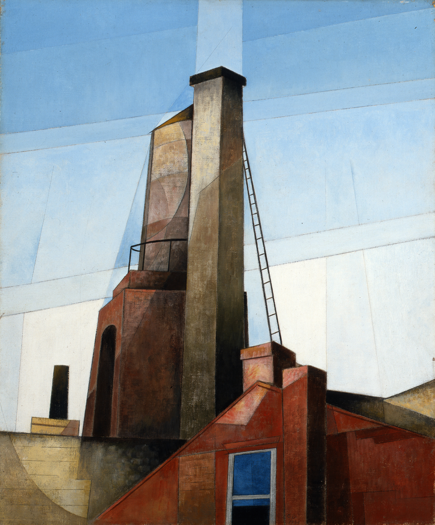
I chose Charles Demuth for his use of geometry to represent light and form, a very abstract concept while still making the subject recognizable.  I find it very interesting how he broke up a picture of something into shapes, and used that to make a commentary on the culture/society of his day.  He was a Precisionist painter, and was heavily influenced by the new, streamlined architecture and machinery of his time.  

All of the paintings of his that I have chosen have great use of gradation of color as well as eye-catching textures.  I also really really like that the majority of his subject matter is of industrial technology, as well as the perspective/point of view in the last 2 of his paintings on here.

Sail in Two Movements; 1919; Tempera, Watercolor, and Pencil on Board
Aucassin and Nicolette; 1921; Oil on Canvas

My Egypt; 1927; Oil on Fiberboard


James Whistler
James Whistler is on this list mainly because of his use of contrast, value, chroma to represent space. He was an Impressionist painter, and I like the use of his blurry/soft light in many of his paintings.  In some of his paintings (such as Variations in Violet and Grey) he really brings out and uses the base color of whatever surface he is painting on.


Variations in Violet and Grey; 1885; Gouache and watercolor on off-white wove paper, mounted on academy board


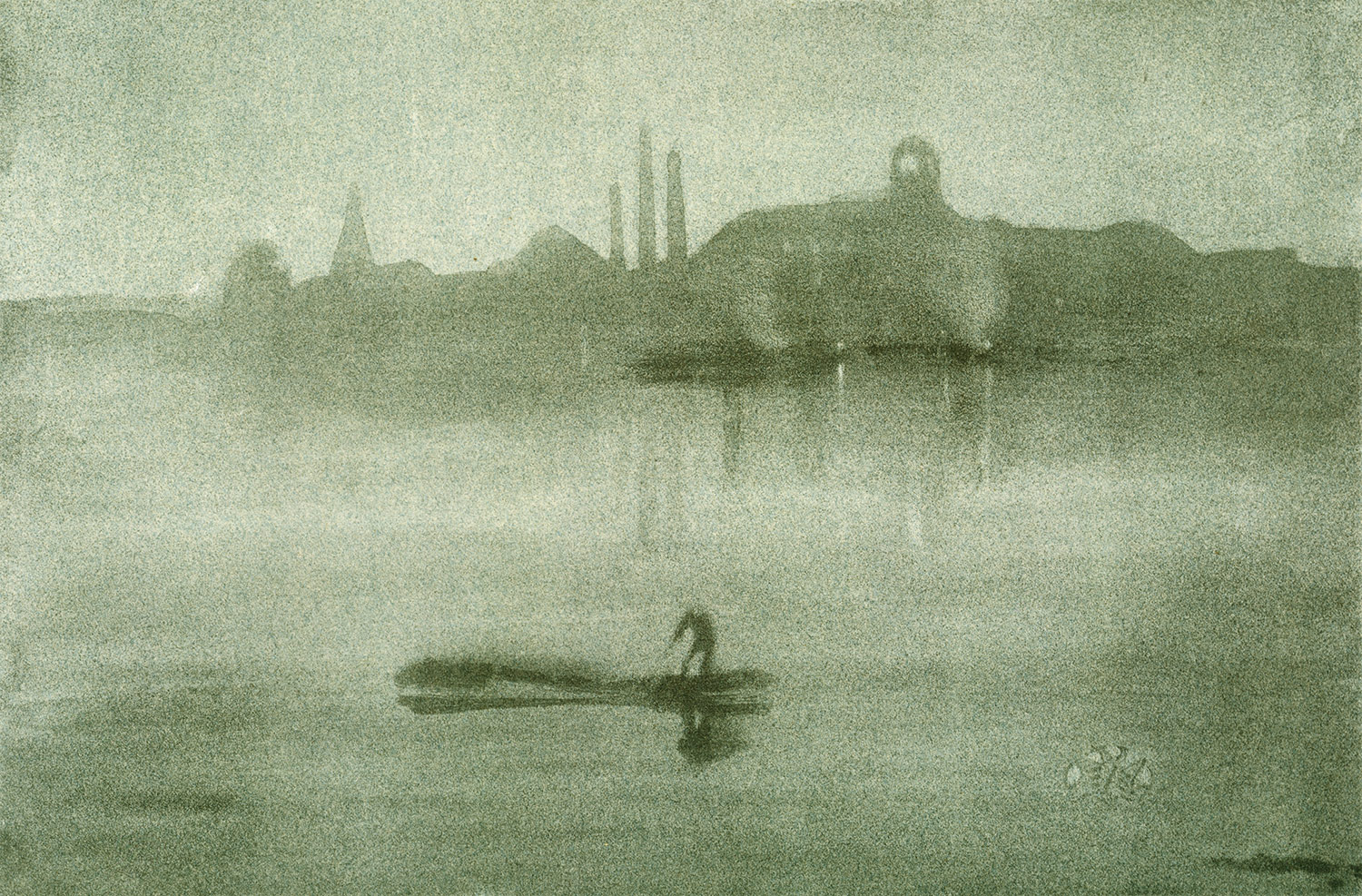
Nocturne: The Thames at Battersea; 1878; Lithograph


Nocturne in Black and Gold: The Falling Rocket; 1870; Oil on Canvas
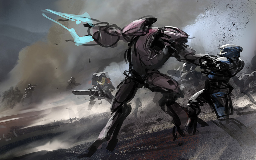
Bobby Chui
I chose Bobby Chui for his bright use of soft light to create form, also (mainly) because of the fantastical, sometimes humorous, and disturbing-looking creatures he creates.  I like the creepy subject matter, also i like the composition and the rim-lit fur in "Beam Me Up Scotty".

The Ugly Duckling

Impostor

Beam Me Up Scotty

Tigger